
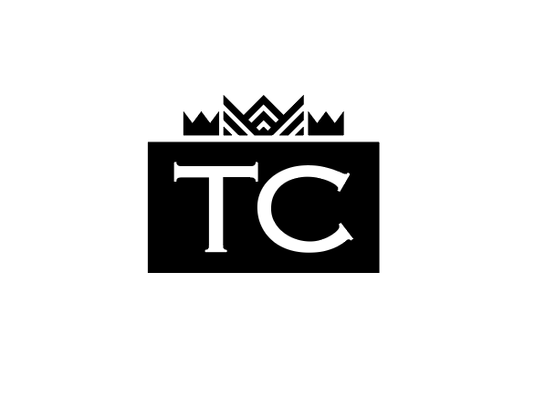
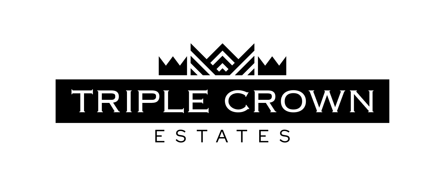
Logo Creation
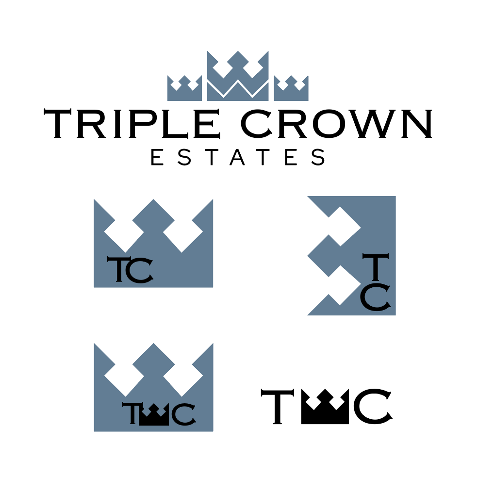
The Triple Crown Estate logo is for a property project by a client at Post & Beam Creative. The parameters for the logo were the name, the colors, and a crown element. The client wanted one logo, and an icon.
To the right is the final logo and icon. The Triple Crown Estates is a specialty project that required specific property marketing.
Triple Crown Estates
To the left is a different direction that we ended up not taking for this project. I found that the design had flaws and didn’t meet the clients standards.
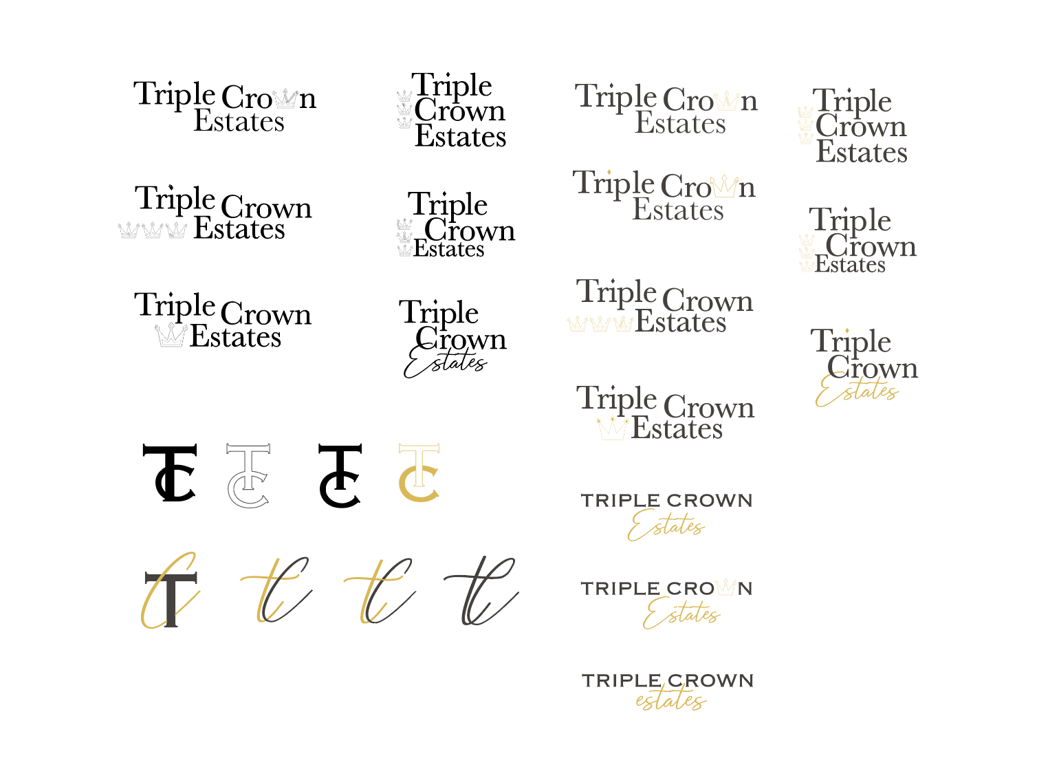
Logo Variation
To the right you’ll find the early stages of this logo, and some progression to the final design.
Showing process is important to me because it reminds me of how far a design can come, and that the finished product is nearly never what you expect it was going to be.